Visualising Results
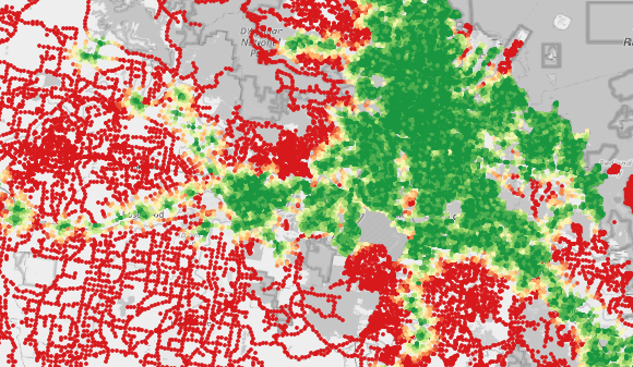
After running the model, results will be displayed similar to this, depending upon the settings of the model run (depicted is a Walk to PT Stop run).
To draw some more detailed analysis of the output, take a look at the layers panel in QGIS. First, make sure that only the correct scenario and model run of interest are set to visible, with all other layers set to hidden. This will make sure the output you see is not a mix of different runs. You can identify a model run by the name the corresponding layer is given. This name is split into two parts, the result name supplied in the model run dialogue, and the mode or run type of a particular run. The is a WalkToPt run and appears as the name suffix. For other run types, such a public transport runs, a time period will also be indicated.
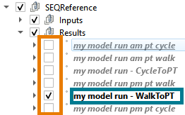
The LUPTAI score shown is a blended composite of accessibility to all the activities selected in the model run. This composite score is intended to mix the relative importance of certain activities (employment accessibility being more important than recreation for instance) to create a single accessibility indicator.
In order to examine the accessiblity indicator in more fine grained detail, take a look at the layer legend:
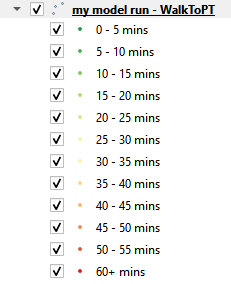
Here we see that the colour map is split into bands of 5 “minute” duration up to 1 hour. For PT model runs, 15 minute intervals are used instead, out to a maximum duration of 3 hours. “Minutes” is in quotes, as the main output of LUPAI is a blended composite, using weighted minutes. As such, it can be more appropriate to thinkk about this as a score, rather than literal minutes of walking to an activity.
Viewing Individual Activity Scores
If you’ve completed a model run and would like to know the travel time to a particular activity rather than the composite, you can also view that in QGIS too. To do this, open the layer styling panel. By default, this will appear right above the layers panel as pictured, but you may want to reposition this window to the right side of screen. In this panel, we can see the applied layer symbology. The Value combo box shows the current quantity displayed, the composite score, converted into minutes from seconds, with a maximum score of one hour. To change this to a component of the composite, open the drop down on the right hand side, to see the components of the composite. Here, there are only two, PTStop and the composite itself. To update the displayed quantity, replace composite with the corresponding activity in the the Value combo box. Note that double clicking an activity will change the value, but the scores will be in seconds instead of minutes. To apply the changes made press the apply button.
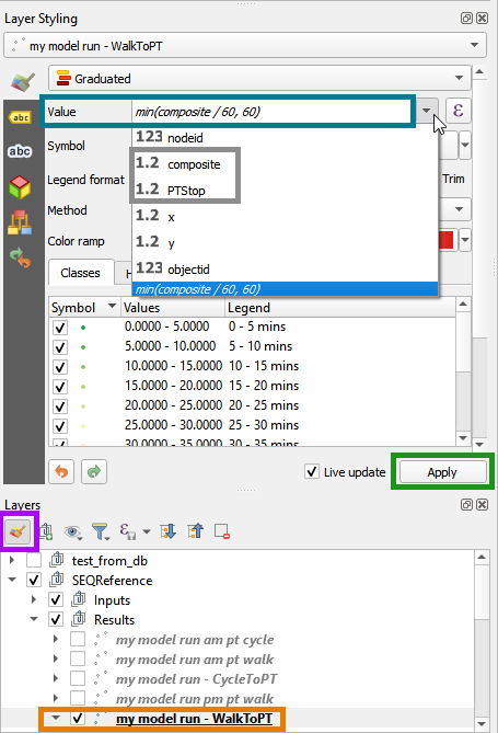
Note that for individual activities, no weighting is applied to the output (unlike the composite). As such, the LUPTAI indicator in this case can be directly interpreted as an accessibility time in minutes.
Viewing Model Output Numerically
It may also be of interest to examine the exact numerical output for a particular node (or subset of nodes) in the network. This can be done directly in QGIS by selecting the results layer of interest and openning the attribute table (keyboard shortcut is F6 by default). The attribute table is a tabular view of the results data. The first column is the :hlteal`nodeid`, which corresponds to the node in the active transport network. For each activity in the model run, there is a corresponding column, along with a column for the composite score. The scores here are in seconds (as opposed to the minutes displayed in the QGIS view). In the pictured case, node 3 has a composite score of 10800, or 3 hours, which is the default threshold value applied if no accessible trips could be found by the model (or more than 3 hours of travel time elapsed). A subset of nodes can be selected using the standard QGIS filtering functionality, typically via specifying nodeids or selecting a subset of points using the polygon selection tool.
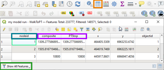
To carry out analysis in an external program (such as excel), one can select all rows of the attribute table by clicking to the left of node id and above the first row, then add this to the clipboard with Ctrl+C.
Alternatively, you can right click on a layer in the layers panel and select Export->Save Features/ Selected Features as and export the layer to GeoPackage, Shapefile, GeoJSON, CSV, XLSX, … for analysis in the software platform of choice.