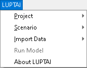
User Interface Overview
In this section we introduce the basics of the LUPTAI QGIS plugin’s user interface. This includes how to access tools and view inputs and outputs.
The LUPTAI QGIS plugin also leverages the GIS capabilities of QGIS to allow the user to edit networks, activity points, etc. To better understand these capabilities check out the QGIS specific documentation, such as the official QGIS user guide.
Layers Panel
The layer’s panel is a standard interface tool in QGIS, the LUPTAI plugin uses this panel to display and organise scenario data.
Any number of scenarios from the open project can be open in the layers panel at the same time, the figure below shows a layers panel (typically found in bottom right of the QGIS window) with two scenarios and a base map open. A scenario has two main groups of data Inputs and Results. The Inputs group contains data that will be input into the accessibility model, while the results contains result data from previous model runs (if no models have been run, the Results group may not appear in the layers panel).
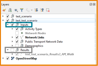
Items in the panel can be hidden or shown by selecting/deselecting the checkbox next to it. Groups, such as the Inputs group, can be uncollapsed/collapsed by clicking the arrow next to them.
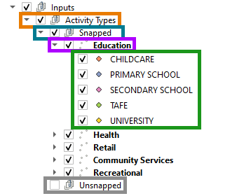
Uncollapsing the Activity Types group (part of the inputs group) we can now see two groups: snapped and unsnapped. The activities types in the unsnapped group are those that have not successfully been snapped to a node, and will not be included in any model runs. While those that are in the snapped group will all be included in any model runs. Each activity has it’s own symbol, and is grouped within a category. In the below image we show the Education category and its contained activities, each with a different symbol.
The Network Nodes item allows the user to display the network nodes. Displaying these can be useful for troubleshooting, but generally add little value and are best left hidden. By right clicking and then clicking ‘Open Attribute Table’ the user can view the node data in spreadsheet style format.
The network links show the active network that will be used in the model. Each type of link has it’s own line symbol (varying by colour and dashes).
The Public Transport Network Data allows the user to visualise the PT network, including stops and routes. The PT Routes contains all routes, grouped by mode. Within a mode, each service has has its own line symbol. In the below image we see that Light Rail mode, has two services in this scenario, each have their own line symbol. The PT Stops item is for the PT Stops of all modes.

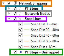
The Network Snapping group within the Public Transport Network Data Group allows the user to explore information on the snapping of PT Stops to the network. This information is worth viewing by the modeller, as poorly snapped stops can lead to unexpected results. The PT Stops group shows the stops location according to the imported data, the Network Nodes shows the node that a stop was snapped to, and the Snap Lines provides a line connecting the the Stop to its snapped node, the colour of the line shows the distance of the snap. The PT Stops - Unsnapped, provides the stops that were unable to be snapped to a node.
The demographics group, contains the points that are used for employment. It’s important for the user to check these over, ensuring that the points used are more-or-less representative of where employment would be located.
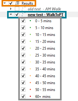
Outside of the Inputs group is the Results group, this contains the results, and allows for results visualisation to be hidden or made visible. In the below image we show two results sets, with one of the results uncollapsed, showing the key for its visualisation the key can be different as it depends on the mode.
This completes the overview of the user interface, for more information on building and running models, delve into other subjects on the sidebar.
